Category: document_design
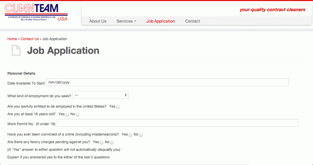
WordPress: CleanTeam USA
What Clean Team USA wanted (and desperately needed) was a redesign for their public-facing informational site. I had to be able to make it fast, responsive, and most importantly able to collect information from visitors who want to apply to the company. Before I could start on the design, I built a company profile of […]
Design in Teaching: Pixel Map
On e issue I encountered as an English teacher in Korea was how to broadly map out an upcoming month’s set of exercises. Designed as a PowerPoint template, this map, inspired by old-school games (à la Tetris), lays out the development of any given project on any scale, which in effect provides documentation for work […]
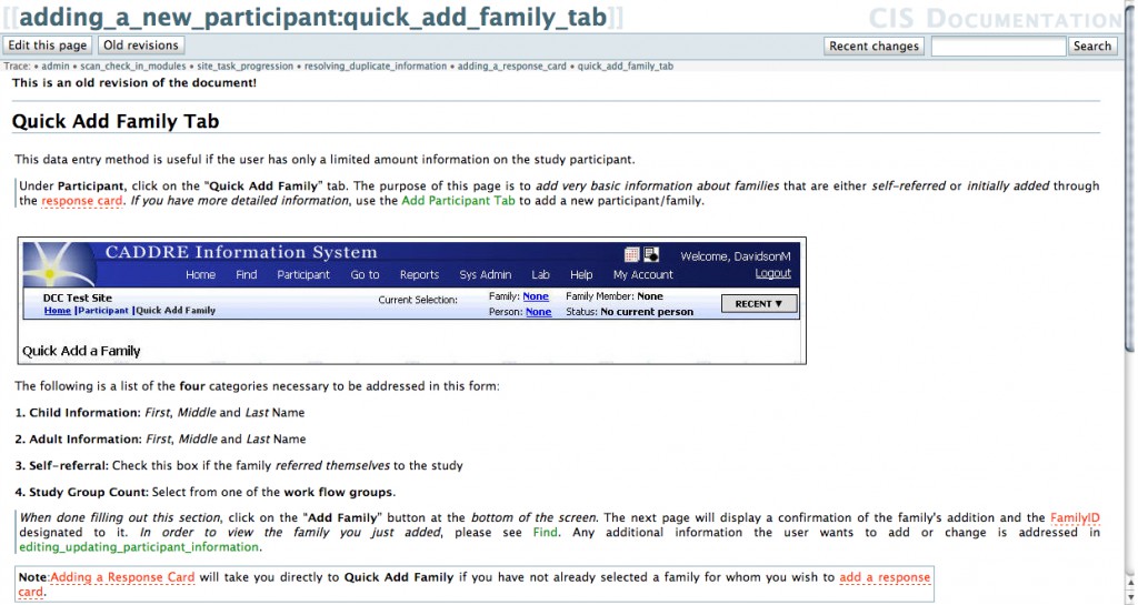
BRIC: Instructional Wiki
The conversion of a hefty hard copy manual used by interviewers at the Biomedical Research Informatics Core for data entry into a self-contained wiki site was one project assigned to me as technical writer. This involved applying concepts covered in my Digital Rhetoric classes to the Wiki’s organic development and sophisticated formatting, planning for what […]
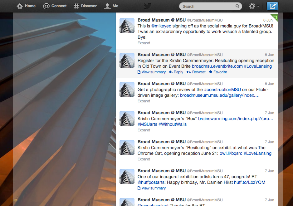
Social Media Writing: Sample (Sign Off/Strategy Guide)
Producing content for The Broad’s social media accounts on Twitter, Flickr, and Facebook, while we established its organizational identity, was a great opportunity as a developer to build an art institution’s presence from the ground floor up. In this social media strategy guide, I recommend methods for building a community of supporters Online and assets […]
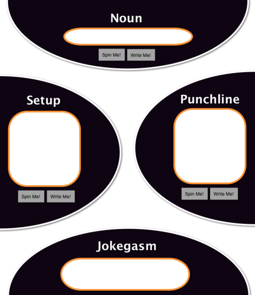
iPhone App: Randomized Joke Generator
This mock up was my initial design pitched to my fellow developers on the 2011 Startup Bus Chicago. It would later change quite a lot from this style as we tested out use cases using a dry erase marker and the input from our team’s iOS developer. I am proud to say that this did […]
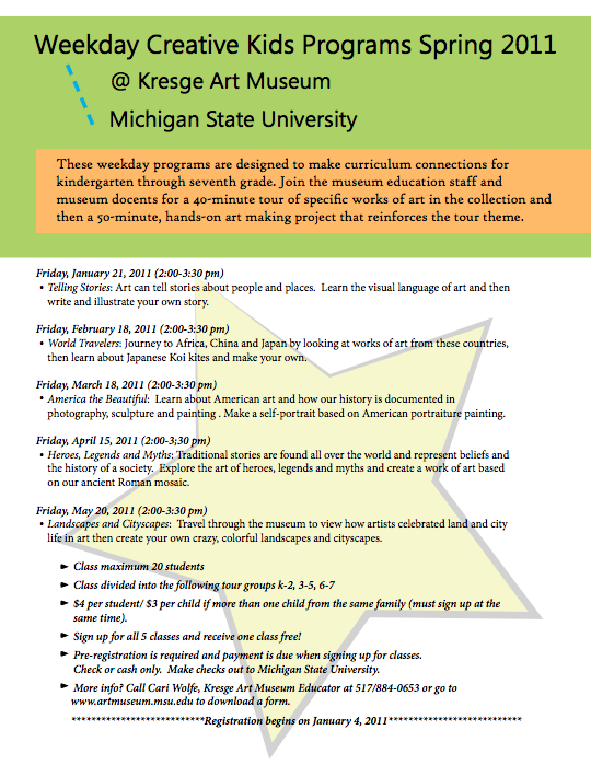
Flyer Design: Creative Kids @ KAM
When I was sent a Publisher designed flyer created from a system template with blocky colors and a very limited design aesthetic, I volunteered to redesign the document with one clear directive in mind: visual appeal. On the original were stars as bullet points, borrowing this single element from my coworker’s design I expanded upon […]
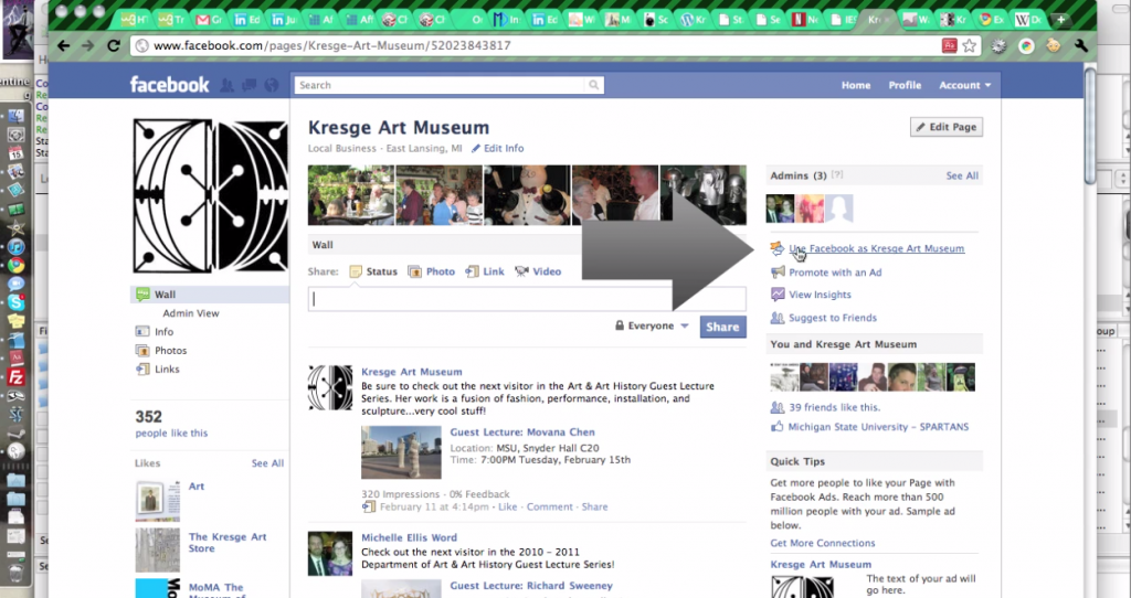
Tutorial: Facebook Pages
Video screencaptured and edited using Camtasia.
Working as an MSU-EL intern at the TIC
Under the Cool Cities Initiative, the City of East Lansing and Michigan State University partnered together to create opportunities for students with the intention of developing local Non Profit Organizations (NPO). Our team of professional writers was tasked with the duty of developing a long term plan for future developments of the Technology Innovation Center […]
